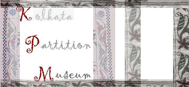
It was convenient that I was to create both the KPMP website and the logo – it is usually simpler to insert an additional element of design into one’s own creation. In case of this particular project, while I did have a free hand, it was (not unpleasantly) bound by extremely specific instructions, likes, and dislikes from and of the only person I coordinated with: Dr. Rituparna Roy, the Managing Trustee of the Kolkata Partition Museum Trust. She spoke to me on behalf of the Trust, conveyed to me its vision, and explained what the logo was supposed to represent and evoke.
She could not visualize the logo – that was my job – but her description was picturesque, to say the least. Our telephonic conversation had begun at 10:30 in the evening and it extended to at least a half hour beyond midnight. I finished odd jobs (I am a night person) and then, at around three in the morning, I decided to put together a draft of the proposed logo. By five, the artwork was ready.
It isn’t always this simple, but I think it was Rituparna’s complete belief in their vision as also her clear narration that created the much-needed inspiration. It also helped that our conversation and the impression I gathered were still fresh in my mind. Things might not have worked out so well or so soon had I waited till the following day.
It might be pertinent to note that this was not the logo I had in mind for KPMP. Because, in my ‘professional’ opinion, it isn’t … sturdy enough. I created another one which would have been better suited for letterheads, posters, even stamps. In any case, the present one is more of an artwork than a logo.
But Rituparna told me very sincerely that when she thought of rejecting this one, she felt an overwhelming sense of loss. Now, that is a rare compliment even though it was more of a reflection on her part at that moment and in any case, the client knows best.
Problem was, since I had originally intended to create a draft, I borrowed whatever element I liked from the Internet and put those together with partial scans from my own repertoire. The composition (or draft) was created digitally without regard to whether or not the borrowed motifs were copyrighted. Turned out, the main motif was. Americans have a word for situations like this; I believe they say: ‘bummer!’ And that adequately describes how I felt – more so because I could not establish contact with the person holding the copyright.
Thankfully, about a week or so before the website was scheduled to go live (and about a month after I had sent out several communications to quite a few virtual addresses), I received a very positive reply. ‘Relieved’ is a good word, and so is ‘thankful’, but how I felt at that moment was blessed.
Concept & Visualization
Rituparna was extremely clear about what the logo would not represent or evoke. Regarding what she felt they did want in it, I had to construe my own narrative to translate her feelings into visual form even though everything she said was extremely detailed and specific (while leaving room for my imagination to stitch them together).
In the context of the museum, KPMP chose not to highlight the gruesomeness of the event of the Partition, and all that was dark and horrific in it. Instead, the focus was to be on those aspects of the aftermath that have continued for over 70 years in the form of social, cultural and even illegal interactions. The last part refers to the reality and, indeed, commonplaceness of illegal immigrants crossing over and living and working in West Bengal and occasionally going back across the border to reappear in a few months’ time. The border being not remotely the kind of patrolled and barb-wired affair usually depicted in the movies.
We also wanted to visualize the essence (and not the actual, literal experience) of moving out, from the perspective of the people from Bangladesh. Their movement (without using the word ‘migration’ and its associations and connotations) out of a vast land, verdant and full of water bodies, across the ever-familiar river into what was their own, but now made alien which, ironically, they were expected to embrace as their own – again?
The keywords were movement, vastness, desolation, strains of memory, river, openness of the sky and land, broken down architecture, glimpses of tradition, culture and even festivities if possible, all lost and yet, somehow, reformed, regained and reestablished – but not as a challenge, or a struggle or even a desperate effort to cling to one’s own heritage.
This movement, forced or no, was from Bengal to Bengal. But into a narrower, less green, more crowded space with an established framework of completely Bengali and yet very different cultural norms. Even the language, its nuances and local accents were starkly different.
What those people brought with them survived, nonetheless. Perhaps, because the land, though laved by rivers in fewer places, and not nearly as vast and full of foliage as on the other side where the grass truly was greener, was still Bengal, still the very same natal earth they were rooted in.
Actualization
Traditional kantha-stich embroidery motifs were used to structure the composition.
The slightly undulated lower border is expected to represent the water element. It is translucent to direct the viewer away from imagining it as uneven terrain. The top border mirrors the lower but not exactly, so that it remains open to interpretation whether it is water or sky that encloses the compositional space.

The left border has a slightly darker blue in the chequerboard design on its left third (compared to the same motif in the vertical compositional block to the right of the text). This was to introduce the colour blue in a not too obvious manner as well as provide a firm but sensitive closure (of sorts) to all that was in the past (symbolized generically by the left border). When speaking of ‘closure’, one could, perhaps, think of remembrances faded with time with senses of loss and sadness, once dominant, now removed to the background allowing the long-uprooted people to hold on to what was beautiful and what they once called home.
The colour blue by itself is not symbolic in the context – it is used to synchronize and balance the compositional elements with the dominant faded pink on the left darkening into rusty red and grays as we move towards the right.
The border on the extreme right is darker than the rest of the pieces to finally close in the composition as well as to convey a sense of finality inherent in the partition – of moving into a closed space. The two vertical elements in-between the left and the right borders and how they divide the space are meant to arouse in the viewer the sense of awe, desolation and loss often evoked by broken down pillars of some long-forgotten zamindari or princely architecture.
The first two vertical elements of design from the left were borrowed from a photograph by David John with his kind permission. With the perfectly coordinated lines and motifs they provided the perfect flow and stability to the composition which the other four elements (adapted from a saree), on their own, could not. The colours have been edited and the snipped portions tilted appropriately to suit compositional requirements.

The font is subtly reminiscent of the Bengali script in how the alphabets in a flowing handwritten piece of Bengali text appear to remain connected.

The dark reds in an angular arrangement are expected to draw focus, as well as concretize the composition otherwise muted as far as intensity of colours is concerned.
The increasing depth of the grays in the three text elements provide weight and make the composition bottom heavy so that it looks stable and grounded. They also balance out the depth of the extreme right border.
The background space created by the text elements is flowing in and out – it is one space, not three, and not meant to suggest loneliness or desolation. On the contrary, it provides an openness to balance the visual confinement in the second and third background segments so that nostalgia and fond remembrances do not turn to morbidity.
I wanted to add a concluding paragraph, but my story ends where the viewer’s begins and it somehow felt appropriate to expect your comments to constitute the concluding bits. I only hope that in the very distant future, this simple blog post becomes one of the historical documents that tell everyone how the Kolkata Partition Museum came to be.
Dear Sir/Madam,
We are students of Centre for Environmental Planning and Technology(CEPT, Ahmedabad) pursuing Master of Architecture in architectural Design. We are currently doing a studio on designing a Bengal Partition Museum and would like to visit your archives during our study tour to Kolkata. Also it would be of great help if we could get access to older maps of Kolkata- especially those related to the partition.
Awaiting your response,
Thankyou
Yours faithfull,
Yamini Manjunath